Lekker Pûh!
A typographic foodblog
Mindset, motto, philosophy ánd foodblog: “Lekker Pûh!” It’s a cheeky Dutch phrase, with a fun food reference. = Lekker pûh!
  = Mmm, lekker.
The blog is a collection of uncomplicated, yummy recipes. Each recipe is available directly online, and additionally each post features a free printable – a unique recipe-specific design, with typography its visual highlight.
Logotype
Important qualities from the mindset are captured in the logotype. Namely, a cheeky joie de vivre and its playful, lively energy.
However, these attention-grabbing qualities mustn't visually overpower the recipes. So elements are included that add coherence and tone down the intensity.
- repeating letters have subtly different shapes, for a playful touch
- a dynamic baseline; letters go up and down but are still optically connected
- long ascenders and descender; they dare to stand out, and simultaneously create a good amount of negative space that tones things down
- one cheeky switch between upper- and lowercase letterforms
- a thin monoline (i.e. line of only one thickness) counteracts busy-ness
- a single, neutral grey, colour; blends in with the background, bringing the (mostly very colourful) recipes to the foreground
Recipes
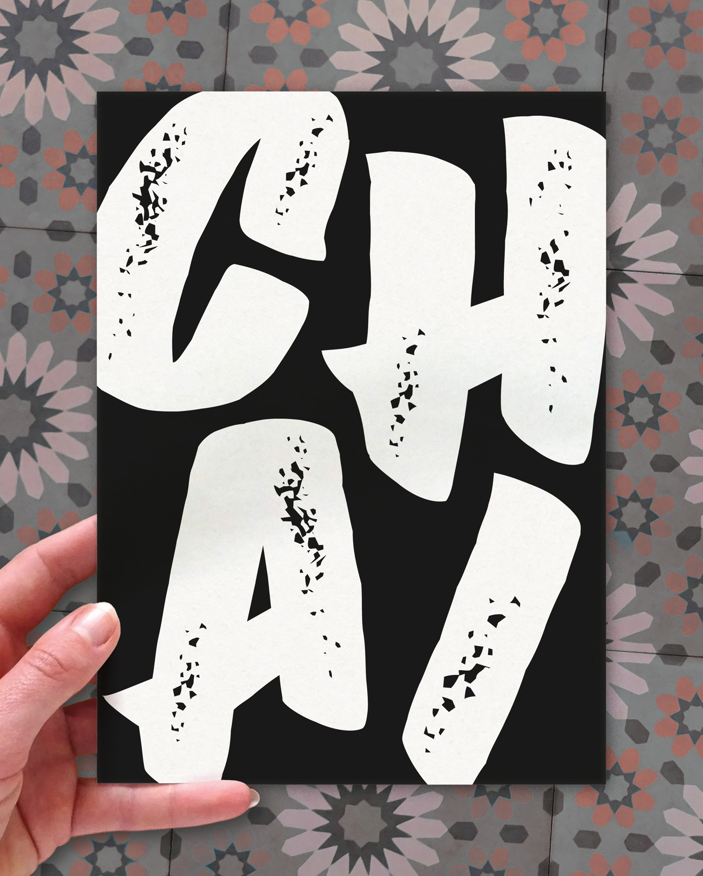
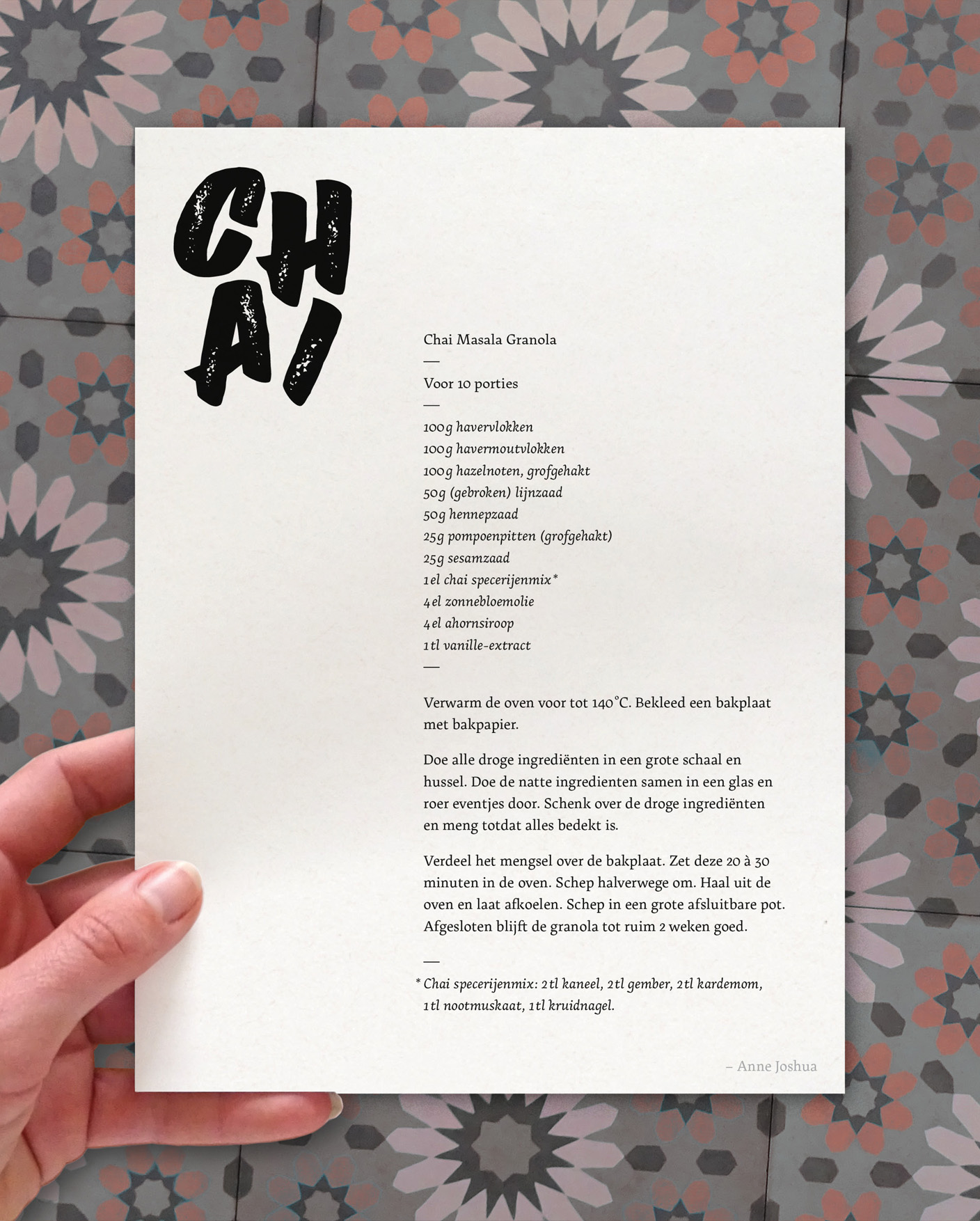
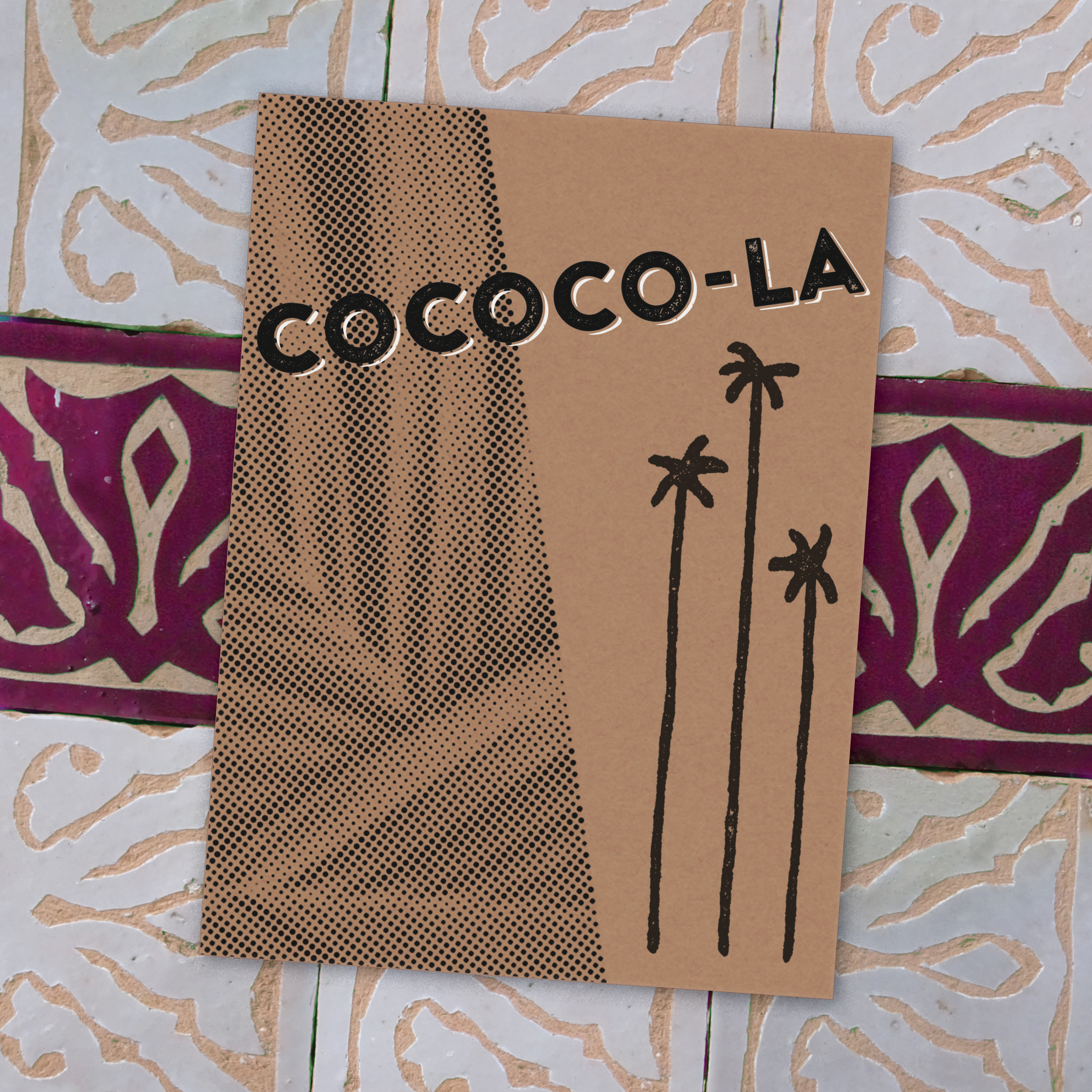
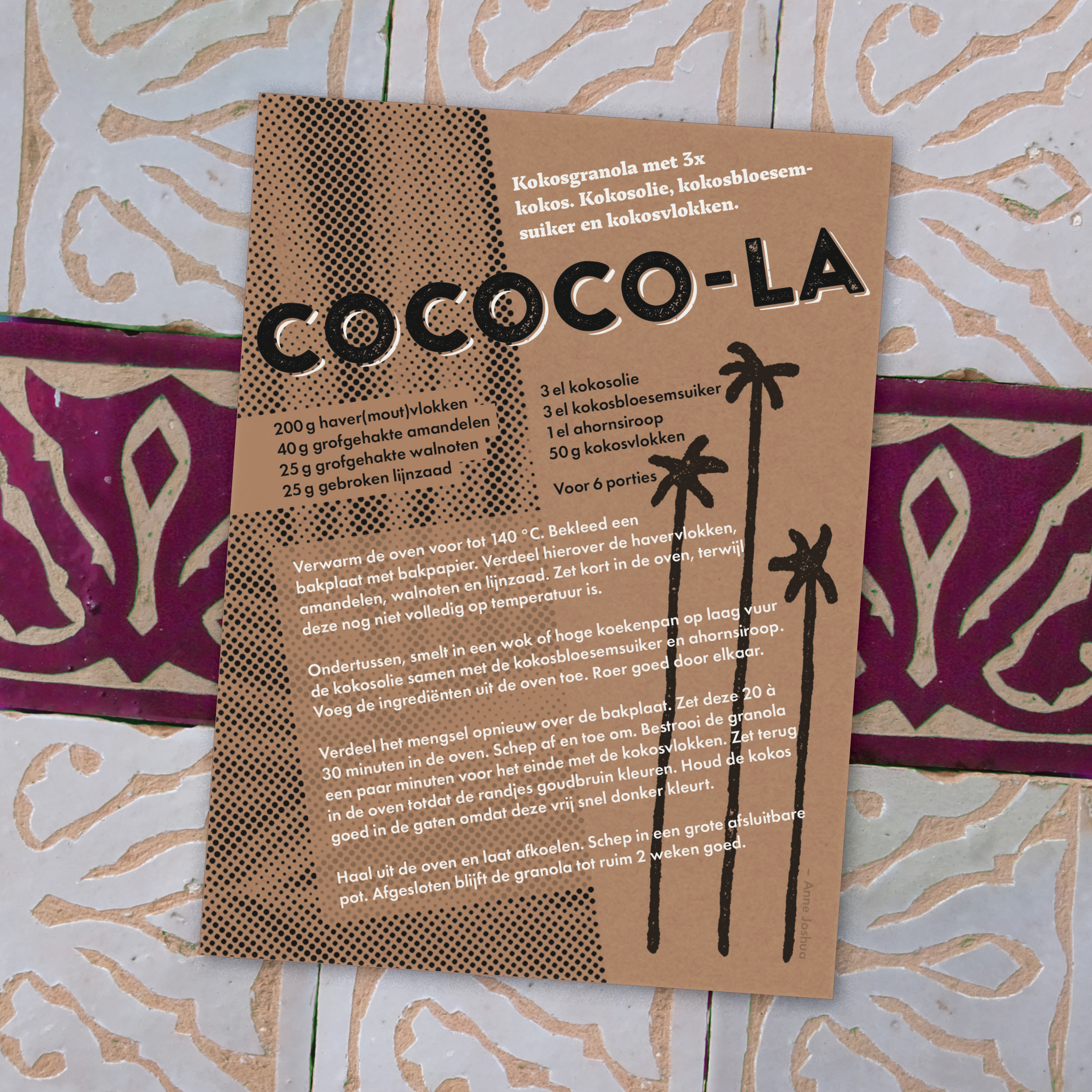
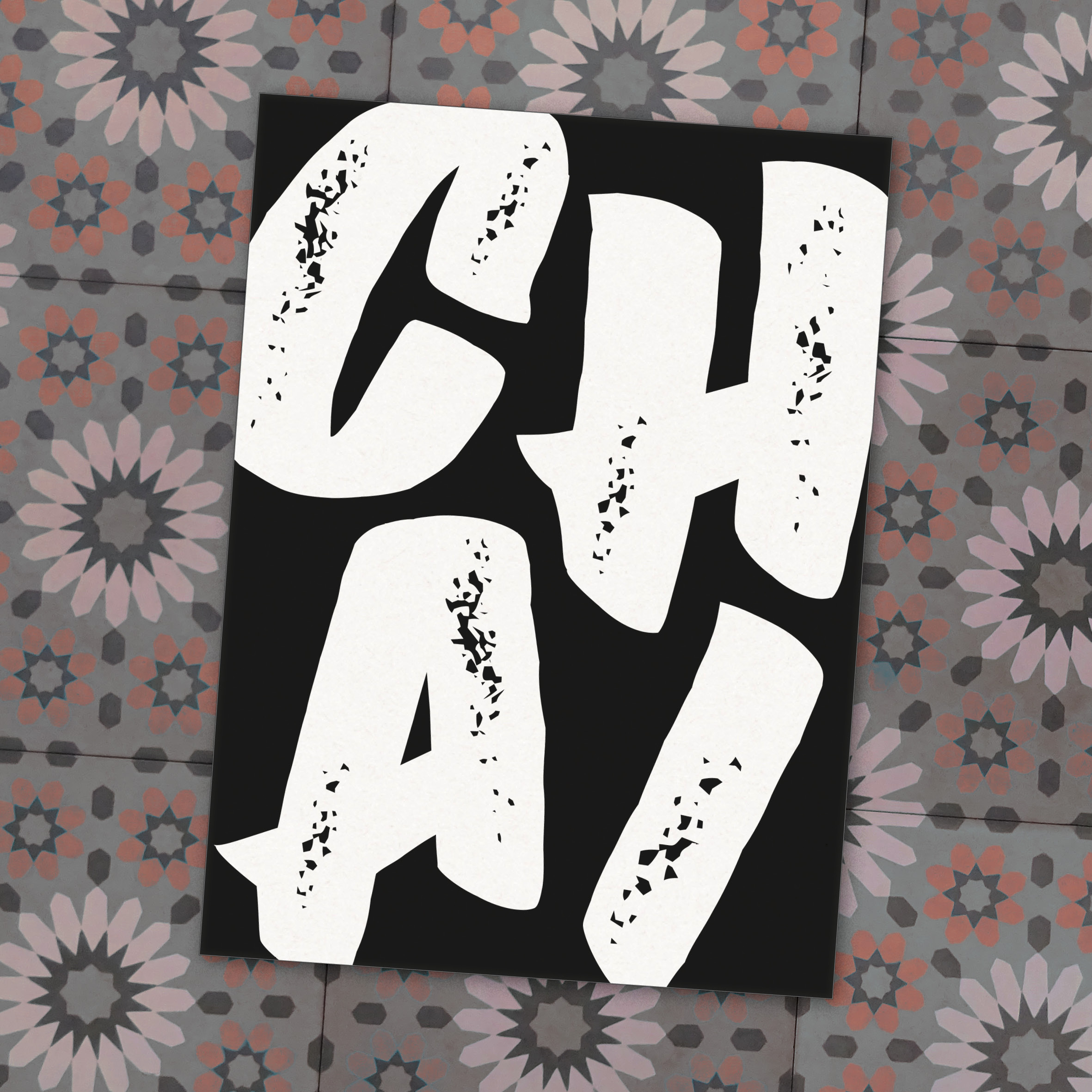
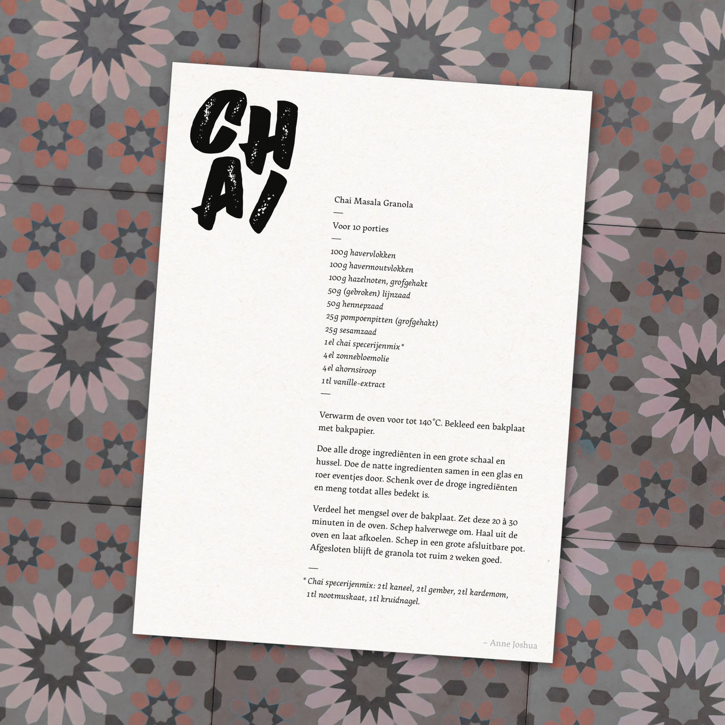
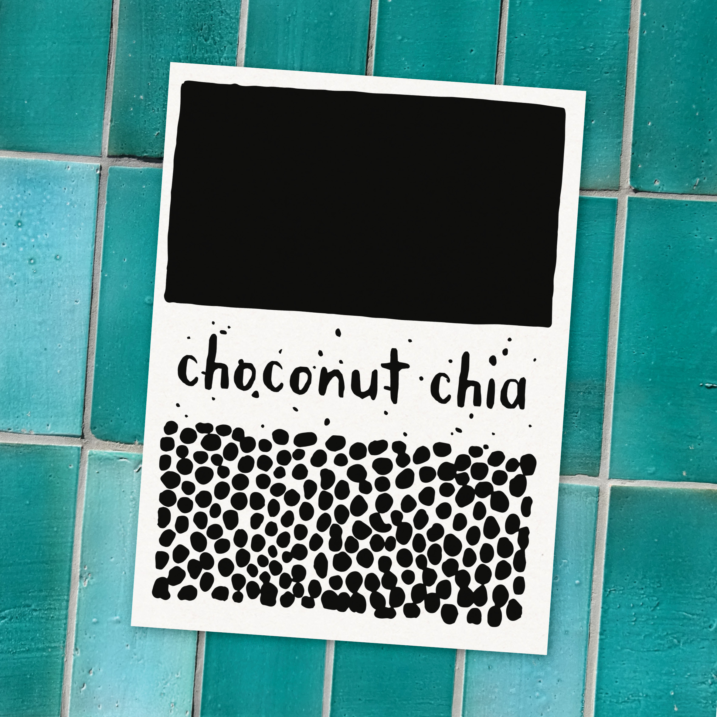
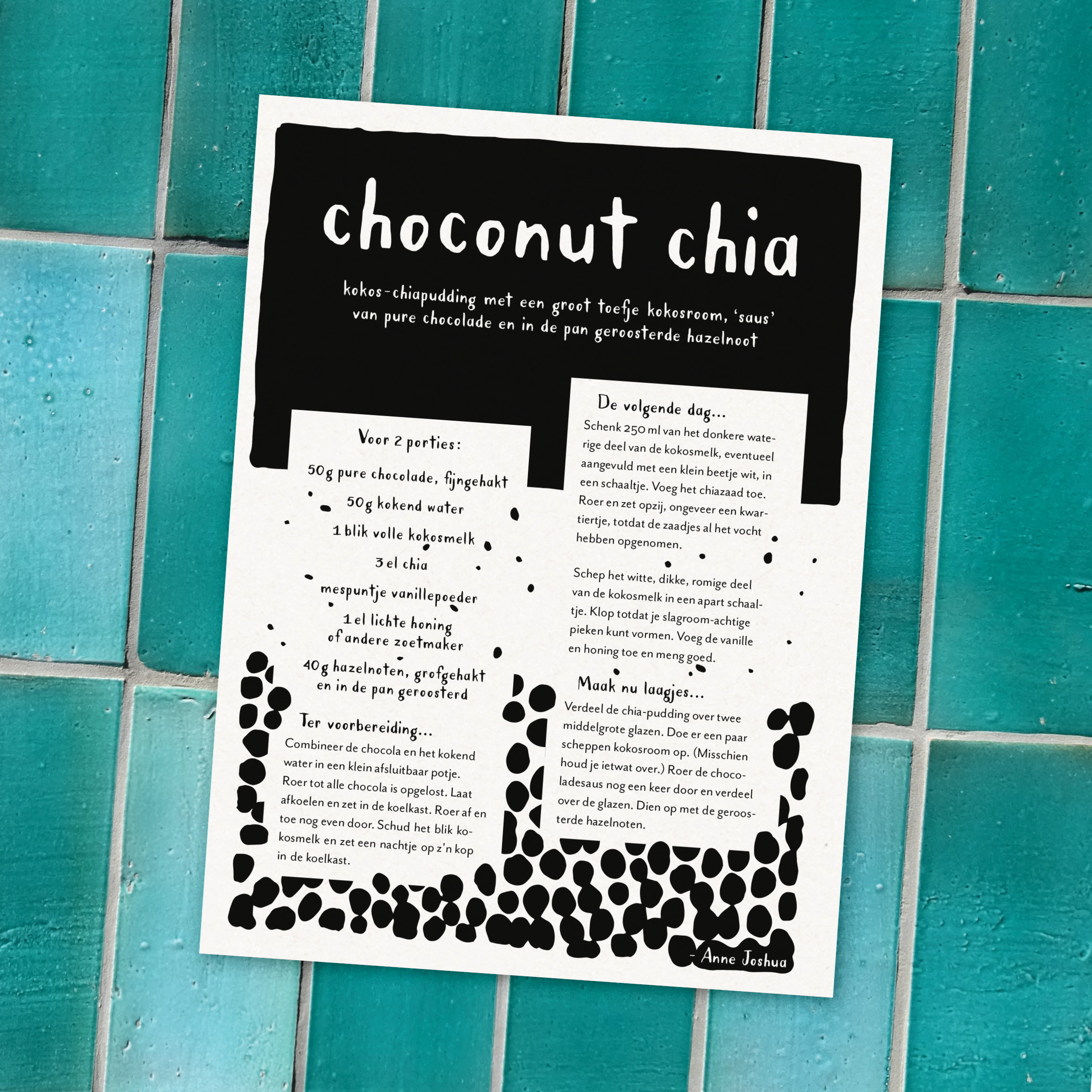
All recipes are available directly online, accompanied by a blogpost packed with extra information. But truly unique are the free printables – double-sided recipe-specific designs. Each one has a logo-like frontside, and instructions on the backside. After printing the free pdf download, you can use it as a bookmark in a favourite cookbook, for example.
Design inspiration are things like: what the meal looks like; produce’s peak season or region of origin; wordplay in the recipe title; a main or singular ingredient (colours, flavour or other characteristics); level of sophistication... Just to name a few.
This variety results in a wide mix of visual styles and the application of different typographic techniques, such as typesetting, lettering (both hand- and digital), sign painting, calligraphy, and penmanship.
Below you’ll find an overview of all recipes. Please, feel free to check out individual ones for particular design choices.
Website
The web design has three distinct page-types: the very visual home page, a table of contents in list-form, and the recipe blogposts.
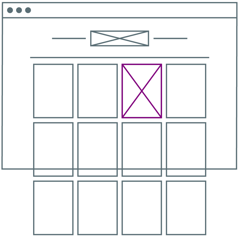
1. The home page is a gallery with thumbnails of each recipe. Upon mouse-hover they flip sides. This bird’s eye view is perfect for a random, or intuitive, discovery of recipes.
2. The table of contents allows for a more intentional discovery of recipes, via search and through recipe categories.
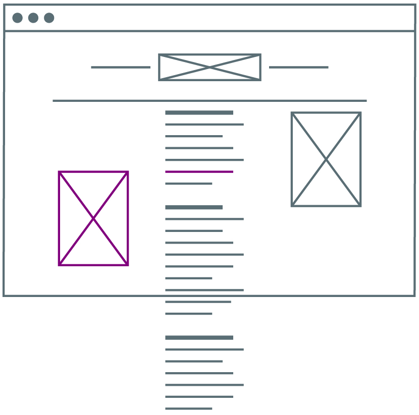
3. The blogposts contain additional helpful information that is not on the printables, including food photography.
One standout technical feature, is a back-end SEO-workaround that makes search engines interpret the more descriptive subtitle as the recipe’s main title, because the (visually more prominent) actual main title often has AI-eluding wordplay.
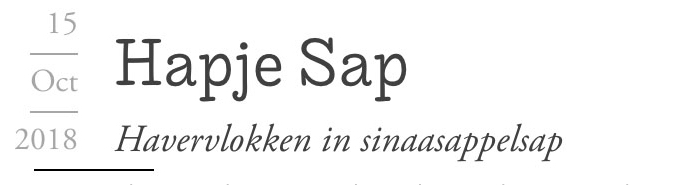
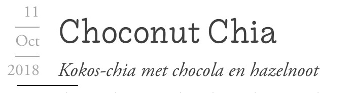
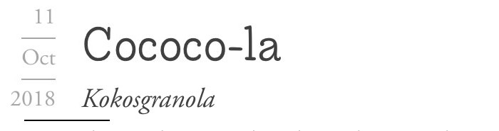
Recipes

Contact:
info@annejoshua.nl